[HCI] 1. Introduction to HCI
1. Introduction to HCI
사람과
그것이 포함된 모든 것을 총괄하는 것이 HCI
실제로는 유저 인터페이스 뿐만 아니라
HCI의 C가 computer에 한정되지 않고 모든 인간이 사용하는 도구로 확장 가능함
HCI in the 1970s
예전에는 생산성이 더 강조되던 시기
그 당시 개발은 waterfall 방식 사용
- 유저 - 극단적인 이분법
- “자연과 스무고개를 해서 이길 수 없다.”
- 실험적으로 usability를 연구
- 특별한 정보를 주지 않는 경우가 많았음
HCI in the 1980s
- 결과를 보고 하는 것이 아니라 설계를 한다음에 유저에게 확인
- 설계 끝까지 가는 것이 아니라 중간 단계에서 유저와의 interaction을 통해 수정에 수정을 거침
- prototyping, mock-ups의 중요성
- formative evaluation
- thinking aloud: 시제품을 유저에게 써보라고 하고 그 때 생각나는 모든 것을 말하기를 요구 후 모든 의견을 취합 및 파악
- 중간 평가의 방법론이 생기기 시작
- Models and theory (vs. guidelines)
- the model human processor
- Fitts’s Law: 사람이 아이콘을 클릭하는 데 걸리는 시간이나 배치를 효과적으로 하게끔 수식으로 규정해 놓은 것
- GOMS: 사람이 메뉴를 보고 어떤식으로 움직이는지 모델링 한 것, operation을 어떻게 할 지 모델링
- mapping models: syntactic-semantic consistency
- syntax: 휴지통에 파일을 버린다
- semantic: 버리는 걸 휴지통으로 만듦으로써 의미를 알게끔하는.(의미가 통하게)
- the active user: prior knowledge, problem solving, and error as primary resources
- 이미 이전에 좀 써 본 사람들(이전 지식을 가진 사람)
- the model human processor
HCI in the 1990s
- UE (usability engineering) is multifaceted, qualitative, field-oriented
- 어디에서 사용하는 지 고려하기 시작
- participatory design, contextual design(맥락을 고려한 디자인), ethnographicallyinformed design(어느 나라 사람이 쓸 것인지, 어떤 문화를 가진 사람이 쓸 것인지를 고려한 디자인)
- drives/integrates system development lifecycle
- version2, version3, ….
- Conceptual frameworks beyond user models
- activity theory, ethnomethodology(민족적인), distributed cognition(개인이 아닌 사회가 갖고 있는 의식, 영향), grounded theory, design rationale
- But diminishing role in mainstream discourse (물론 mainstream과 멀어지기 시작)
- 기술들이 너무 integrated 되어 있어서 신경 쓰지 않아도될 정도가 됨
- User interface technology too well integrated!
Context of HCI: Changes in Computer Use
- 1960’s - Professional programmers, software psychology
- 전문성이 짙음
- 1970’s - Business professionals, mainframes, command-line
- 비지니스에서 사용되기 시작, 굉장히 큰 mainframe과 같은 것이 회사에서 사용되기 시작
- 1980’s - Large, diverse user groups, the computer for the rest of us
- 컴퓨터의 보편화
- 1990’s - World Wide Web and more, information access & overload
- 2000+ - Ubiquitous computing, diversity in task, device, …
Historical basis of HCI
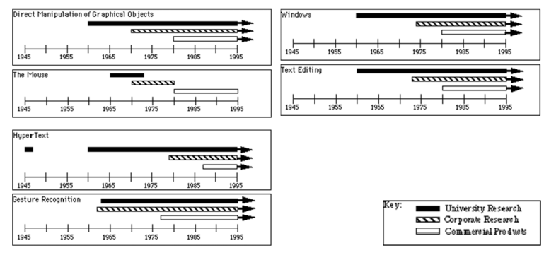
- University Research
- Corporate Research
- Commercial Products
마우스 연구가 끊긴 것이 마우스를 연구하지 않는다는 것이 아니라 마우스라는 개념으로서 추가적인 integration이 거의 끝난 것
Basic Interaction (1)
- Graphical Objects
- 1963 (MIT)
- Graphical Objects manipulated by a pointing device (light pen)
- Objects could be selected, moved, resized, etc.
- 1966 (Imperial College, London)
- Icons, Gesture Recognition, Dynamic Menus, etc.
- 1970 (XEROX Palo Alto Research Center)
- XEROX: 복사기로 유명한 회사, 복사한다는 뜻이기도 함.
- Object selection and manipulation
- WYSIWYG
- What You See What You Get
- 1963 (MIT)
Basic Interaction (2)
- Mouse
- 1965 (Stanford Research Lab [SRI])
- Created to be a cheap replacement for light pens
- light pen이 비쌈 -> 싼 걸로 바꾸고자 했던 것이 mouse
- 1970
- Adopted at Xerox PARC
- First appeared commercially as part of
- The Xerox Star (1981),
- The Apple Lisa (1982),
- The Apple Macintosh (1984).
- 1965 (Stanford Research Lab [SRI])
Basic Interaction (3)
- Windows
- 1968 (Stanford Research Lab [SRI])
- 1969 - 1974 (Xerox PARC)
- Smalltalk System
- 1974 (MIT)
- EMACS Text Editor - 우리가 사용하는 것과 거의 비슷한 에디터
- 1981 (Xerox PARC)
- The Cedar Window Manager
- 1981 Xerox Star
- 1982 Apple Lisa
- 1983 (Carnegie Mellon University funded by IBM))
- Andrew window manager
- 1984 Apple Macintosh
- 훨씬 더 자연스럽게
- The early versions of the Star and Microsoft Windows were tiled, but eventually they supported overlapping windows like the Lisa and Macintosh.
Applications (1)
- Drawing programs
- uses a mouse for graphics (1965)
- uses a tablet (1971)
- handling of lines and curves (1975)
- Text Editing
- first word processor with automatic word wrap, search & replace, user-definable macros, scrolling text, & commands to move, copy, and delete characters, words, or blocks of text (1962)
- screen editing & formatting of arbitrary-sized strings with a lightpen (1967)
- mouse-based editing (1968)
- first WYSIWYG editor-formatter (1974)
Applications (2)
- Spreadsheets
- Initial spreadsheet was VisiCalc (1977-8) for the Apple II
- HyperText
- The idea where documents are linked to related documents (1945)
- Ted Nelson coined the term “hypertext” (1965)
- NLS system was one of the first on-line journals, and it included full linking of articles (1970)
- Online System - NLS
- HyperCard from Apple (1988) significantly helped to bring the idea to a wide audience
- Tim Berners-Lee used the hypertext idea to create the World Wide Web in 1990 at the government-funded European Particle Physics Laboratory (CERN)
- 입자 가속기
- Mosaic, the first popular hypertext browser for the World-Wide Web, released in 1993
- 웹 브라우저
Applications (3)
- Computer Aided Design (CAD)
- first CAD systems similar to drawing programs (1963)
- pioneering work on interactive 3D CAD system (1963)
- 처음 목적이 배나 이런 것들을 위한 것이었기 때문에 3D로 시작
- first CAD/CAM (manufacture) system in industry was probably General Motor’s DAC-1 (about 1963)
- Video Games
- first graphical video game was probably SpaceWar (1962)
- the first computer joysticks (1962)
- early computer adventure game was created (1966)
- first popular commercial game was Pong (about 1976).
Up & Coming Areas (1)
- Gesture Recognition
- first pen-based input device used light-pen gestures (1963)
- first trainable gesture recognizer (1964)
- a gesture-based text editor using proof-reading symbols (1969)
- gesture recognition has been used in commercial CAD systems since the 1970s
- came to universal notice with the Apple Newton (1992)
- Multimedia
- 컴퓨터에 등장하는 것을 모두 한꺼번에 등장토록 하는(텍스트, 그래픽, 스피치, …)
- multiple windows with integrated text and graphics (1968)
- Interactive Graphical Documents project was the first hypermedia system which used raster graphics and text (1979- 1983)
- Diamond project explored combining multimedia (text, spreadsheets, graphics, speech) (1982)
Up & Coming Areas (2)
- 3-D
- first system 3-D CAD system (1963)
- first interactive 3-D system used for molecular modelling (1966)
- the late 60’s and early 70’s saw the flowering of 3D raster graphics funded by the government
- the military-industrial flight simulation work of the 60’s - 70’s led the way to making 3-D real-time
- Virtual Reality
- 이 때 당시에 VR 장비가 ATM보다 큰 정도였음
- original work on VR funded by Air Force (1965-1968)
- study of force feedback, early research on head-mounted displays and on the DataGlove (1971)
Up & Coming Areas (2)
- Computer Supported Cooperative Work
- remote participation of multiple people at various sites (1968)
- Electronic mail, still the most widespread multi-user software, was enabled by the ARPAnet (1969)
- and by the Ethernet from Xerox PARC (1973)
- an early computer conferencing system (1975)
- Natural language and speech
- Speech synthesis
- Speech recognition
HCI as a business necessity
- Can the users be ignored? (Linux, Windows,…)
- NO
- HCI + Usability engineering are a crucial business necessity
- 피쳐폰만 해도 되는 기능이 꽤 있었는데 인터페이스 하나만 바꾸었더니(스마트폰) 굉장한 혁신을 불러옴
- Good Interface & Interaction Design should not be added after system is built
- Supporting users is an integral part of the design. To do this one must consider …
- International Standards in HCI and Ergonomics
- User population is growing (size, diversity, etc.)
- Expanding awareness amongst users of what can be achieved
- HCI + Usability engineering are a crucial business necessity
Case Study (1)
- A mechanical syringe was once being developed. An input device had to be created in order to enter the injected dose
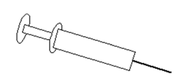
Case Study (2)
- A prototype was developed by the manufacturing company and demonstrated to the hospital staff. Happily they quickly noticed the potentially fatal flaw in its interface.
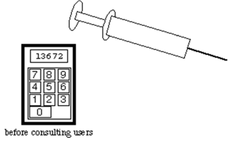
키를 잘못누르면 망한다는 인터페이스
Case Study (3)
- The doses were entered by a numeric keypad: an accidental keypress and the dose could be out by a factor of 10! The production version had individual increment/decrement buttons for each digit
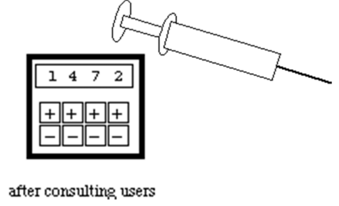
단순히 편하고 멋진 디자인만이 HCI에서 생각하는 것이 아니라 안전성, 편의성 간의 tradeoff를 생각해 봐서 최적의 인터페이스를 고려해 내는 것이다.
Safety-critical systems
- Poor designs
- Very common in
- Safety
- Life-critical
- Which all depend on computer-control
- We need to understand why these happen?
- Disasters
- Accidents
- Frustrations
- Very common in
‘User Hostile’ example
- Poor HCI can lead to User Hostile systems rather than User Friendly ones …
- John has a stereo system with a matched set of components made by the same manufacturer: a receiver, a CD player, and a cassette deck, stacked in that order. They all have the on/off button on the left side. Every time John goes to turn off all three components, he presses the top left button on the receiver, which turns it off; then he presses the top left button on the CD player, which turns it off; then, naturally, he presses the top left button on the cassette deck – which pops open the cassette door.
- 이런 일이 발생하는 이유는 앰프를 만드는 팀과 카세트를 만드는 팀이 다르다.(회사는 같더라도)
- stereo 시스템이 있어야 되는 이유는 커다란 스피커를 핸들링 하기 위해서 나온 것이다.(핸드폰 x)
It’s obvious
- It seems “obvious” that the manufacturer could have improved the interface
- putting all three buttons in the same location
- But it clearly wasn’t obvious to the system’s designers!!
- Most actions used to accomplish tasks with an interface are quite obvious to people who know them, including, of course, the software designer. But the actions are often not obvious to the first-time user.
Another example…
- Imagine a first-time user of a computer
- he has been shown how to login to the system
- has done some work
- is now finished with the computer for the day
- Experienced computer users will find it obvious that a logout command is needed.
- But it may not occur to first-time users that a special action is required to end the session.
- People don’t “log out” of typewriters or televisions or video games, so why should they log out of computers?
- Learning to predict problems like these by taking the user’s point of view is a skill that requires practice.
- 이런 것들은 연습을 요구하는 스킬이잖아?!
- 엑셀 파일을 x를 눌러 껐는데 저장 여부를 묻는 팝업창이 없다면 UX는 최악일 것이다.
처음 쓰는 유저도 사용할 수 있도록 유도할 수 있는 디자인이 좋은 디자인이다.
만약 예상치 못한 일로 어떤 사용자에게는 큰 일이 벌어진다면 그 사용자는 다시는 사용하지 않을 것이다.
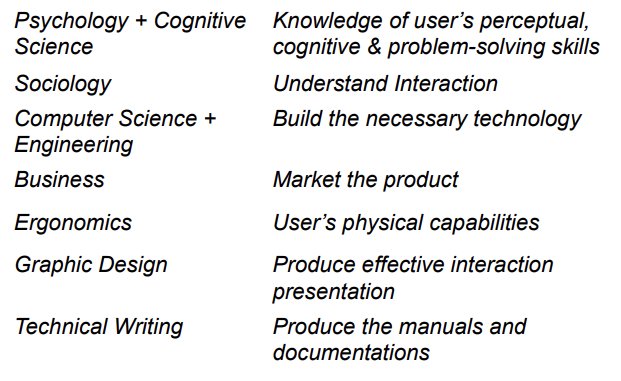
Who studies HCI?
- Multi-discipline field …

댓글남기기