[HCI] 4. Interaction
What is interaction?
- communication
- user <-> system
- 이를 어떻게 모델링 할 수 있는지?
- interaction models
- translations between user and system
- ergonomics (인간 공학)
- physical characteristics of interaction
- interaction styles
- the nature of user/system dialog
- context
- social, organizational, motivational
1. Models of interaction: Some terms of interaction
- domain – the area of work under study
- e.g. graphic design
- goal – what you want to achieve; or final result to be achieved
- e.g. create a solid red triangle
- task– how you go about doing it; structured set of related activities undertaken in a sequence – ultimately in terms of operations or actions
- e.g. … select fill tool, click over triangle
- goal과 task가 사용될 때는 마구 섞여서 사용된다.(context를 파악해야 함)
- note …
- use of terms differs a lot especially task/goal !!!
- system’s language vs. user’s language
Donald Norman’s model
-
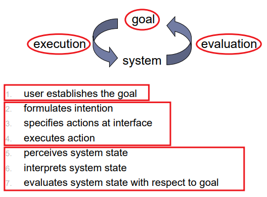
Seven stages
-
user establishes the goal
- formulates intention
- specifies actions at interface
- executes action
- perceives system state
- interprets system state
- evaluates system state with respect to goal
-
-
Norman’s model concentrates on user’s view of the interface
Execution/evaluation loop
Using Norman’s model
- Some systems are harder to use than others
- Gulf of Execution
- Gap btw: user’s formulation of actions ≠ actions allowed by the system
- Gulf of Evaluation
- Gap btw: user’s expectation of changed system state ≠ actual presentation of this state
- 실제와 유저가 생각했던 것과 다를 때
- Gulf of Execution Example: VCR problem

Abowd and Beale framework
- extension of Norman…
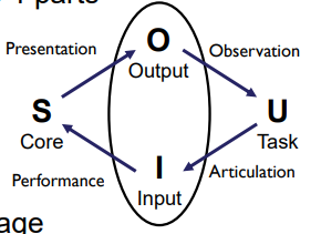
- their interaction framework has 4 parts
- user
- input
- system
- output
- each has its own unique language interaction => translation between languages
- problems in interaction = problems in translation
Using Abowd & Beale’s model
-
user intentions
-> translated into actions at the interface
->translated into alterations of system state
-> reflected in the output display
-> interpreted by the user
-
general framework for understanding interaction
- not restricted to electronic computer systems
- identifies all major components involved in interaction
- allows comparative assessment of systems
- 시스템을 비교 평가 할 수 있다.
- an abstraction
Ergonomics (Physical aspects of Interfaces)
- Study of the physical characteristics of interaction
- Also known as human factors – but this can also be used to mean much of HCI!
- Ergonomics is good at defining standards and guidelines for constraining the way we design certain aspects of systems
Ergonomics - examples
- arrangement of controls and displays
- e.g. controls grouped according to function or frequency of use, or sequentially
- surrounding environment
- e.g. seating arrangements adaptable to cope with all sizes of user
- 모든 규모의 사용자를 수용할 수 있는 좌석 배치
- e.g. seating arrangements adaptable to cope with all sizes of user
- health issues
- e.g. physical position, environmental conditions (temperature, humidity), lighting, noise,
- use of colour
- e.g. use of red for warning, green for okay, awareness of colour-blindness etc.
Ergonomics (Industrial interfaces)
- Office interface vs. industrial interface?
- Context matters!
| office | industrial | |
|---|---|---|
| type of data | textual | numeric |
| rate of change | slow | fast |
| environment | clean | dirty |
- … the oil-soaked mouse vs. the touchpad
Indirect manipulation

- office – direct manipulation
- user interacts with artificial world
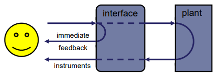
- industrial – indirect manipulation
- user interacts with real world through interface
- issues ..
- feedback
- delays
2. Common interaction styles: Command line interface
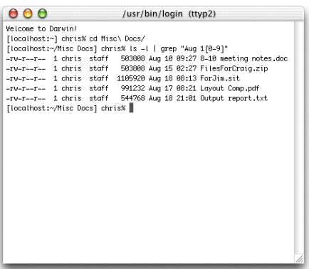
- Way of expressing instructions to the computer directly
- function keys, single characters, short abbreviations, whole words, or a combination
- suitable for repetitive tasks
- better for expert users than novices
- offers direct access to system functionality
- command names/abbr. should be meaningful!
- Typical example: the Unix system
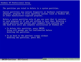
Query interfaces
- Question/answer interfaces
- user led through interaction via series of questions
- suitable for novice users but restricted functionality
- often used in information systems
- Query languages (e.g. SQL)
- used to retrieve information from database
- requires understanding of database structure and language syntax, hence requires some expertise
Form-fills
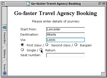
- Primarily for data entry or data retrieval
- Screen like paper form.
- Data put in relevant place
- Requires
- good design
- obvious correction facilities
Spreadsheets
- first spreadsheet VisiCalc, followed by Lotus 1-2-3, MS Excel most common today
- sophisticated variation of form-filling.
- grid of cells contain a value or a formula
- formula can involve values of other cells
- e.g. sum of all cells in this column
- user can enter and alter data spreadsheet maintains consistency
WIMP Interface
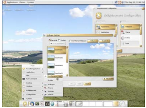
- Windows, Icons, Menus, Pointers
- default style for majority of interactive computer systems, especially PCs and desktop machines
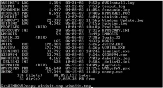
- Before WIMP: Command Line Interface (CLI)
- Needed to know each command’s keyword
- Needed to know the syntax for each comman
- Eg. Copy source_file destination_file
Problems With CLI
- People found it hard to use
- Forgot command names
- Would transpose command parameters (옵션이 많음)
- Novices would be overwhelmed (‘blank screen’)
- Cognitive analysis
- Many of the problems can be traced to recall vs. recognition memory
- recall보다 recognition이 많아지도록 구성
- Commands and syntax had to be recalled (quite hard)
- Almost no recall cues are provided
- Can expect even experts to make mistakes
- Many of the problems can be traced to recall vs. recognition memory
Solution: WIMP
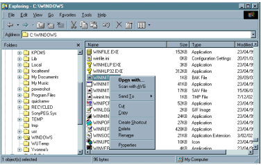
-
Xerox invented the Windows Icons Mouse and Pointer (WIMP) interface
-
Very few commands (mouse buttons), bring up options
- Visual metaphor
- Contextually appropriate commands are brought up
- Drag & Drop ‘removes’ parameters
Why WIMP works
- Uses recognition rather than recall (기억보다 인지에 의존)
- Icons show available commands
- Menus give complete list of available commands
- Visual metaphor removes abstract syntax
- No longer remember order of commands or positions in path trees
- Can ‘see’ where things are, move them from place to place
- Reduced likelyhood of making syntax errors
Windows, Icons, Pointers
- Windows: Areas of the screen that behave as if they were independent
- can contain text or graphics
- can be moved or resized or overlapped
- Icons: Small picture or image to represent some object in the interface
- can be many, various, highly stylized, and realistic representations.
- Pointers: WIMP style relies on pointing and selecting things
- minimal typing
- wide variety of graphical images
and Menus
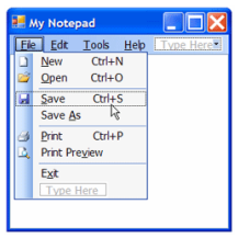
- Set of options displayed on the screen
- Options visible
- less recall - easier to use
- rely on recognition so names should be meaningful
- Selection by:
- numbers, letters, arrow keys, mouse
- combination (e.g. mouse plus accelerators)
- Often options hierarchically grouped
- sensible grouping is needed
- problem – take a lot of screen space solution
- pop-up: menu appears when needed
Kinds of Menus
- Menu bar at top of screen, menu drags down
- pull-down menu - mouse hold and drag down menu, and remains available as long as the user holds it open
- drop-down menu - mouse click reveals menu
- fall-down menus - mouse just moves over bar!
- Contextual menu appears where you are
- pop-up menus - actions for selected object
- 우클릭
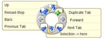
- pie menus - arranged in a circle
- easier to select item (larger target area)
- Quicker (same distance to any option) … but not widely used!
- pop-up menus - actions for selected object
Menus extras
- Cascading menus
- hierarchical menu structure
- menu selection opens new menu
- and so in ad infinitum
- Keyboard accelerators (단축키)
- key combinations - same effect as menu item
- two kinds
- active when menu open – usually first letter
- active when menu closed – usually Ctrl + letter
- usually different with different applications!!!
3. Menus design issues: Buttons & Dialogue boxes

- individual and isolated regions within a display that can be selected to invoke an action
- Special kinds
- radio buttons
- set of mutually exclusive choices
- check boxes
- set of non-exclusive choices
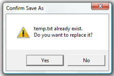
- Dialogue boxes (그림 4)
- information windows that pop up to inform of an important event or request information.
- e.g: when saving a file, a dialogue box is displayed to get the filename and location. Once the file is saved, the box disappears.
Toolbars
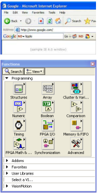
- long lines of icons … … but what do they do?
- fast access to common actions
- often customizable:
- choose which toolbars to see
- choose what options are on it
- Palettes and tear-off menus
- Problem: menu not there when you want it
- Solution:
- palettes – little windows of actions, shown/hidden via menu option. e.g. available shapes in drawing package tear-off and pin-up menus – menu ‘tears off’ to become palette
Look and … feel
- WIMP systems have the same elements:
- windows, icons., menus, pointers, buttons, etc.
- but different window systems … behave differently
- e.g. MacOS vs Windows menus
- appearance + behaviour = look and feel
- easy to focus on look
- what about feel?
4. Consideration in Interaction Error and repair
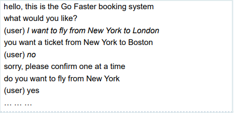
- can’t always avoid errors … … but we can put them right
- Human errors: Slip & Mistake
- incorrect action vs misunderstanding!
- make it easy to detect errors … then the user can repair them
Initiative
- who has the initiative?
- old question–answer – computer
- WIMP interface – user
- WIMP exceptions …
- pre-emptive parts of the interface
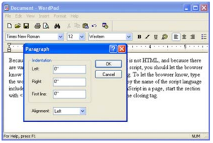
- modal dialog boxes
- come and won’t go away!
- 튀어나와서 안 없어지는
- good for errors, essential steps
- but use with care
- come and won’t go away!
Context & Experience
- Interaction affected by social and organizational context
- By other people: desire to impress, competition, fear of failure
- By motivation: fear, allegiance, ambition, self-satisfaction
- Inadequate systems cause frustration and lack of motivation
- Experience, engagement and fun
- Virtues of WINP design
- designing experience
- physical engagement
- managing value
- Virtues of WINP design
Experience?
- home, entertainment, shopping
- not enough that people can use a system
- they must want to use it!
- 사용할 수 있는 것이 목적이 아니라 유저가 사용하고 싶어해야 한다.
- psychology of experience
- Flow: The Psychology of Optimal Experience (Prof. Csikszentimihalyi)
- 완전한 몰입
- A state in which people are so involved in an activity that nothing else seems to matter
- balance between anxiety and boredom: optimal challenge, sense of control
- Flow: The Psychology of Optimal Experience (Prof. Csikszentimihalyi)
- education
- zone of proximal(근위) development
- things you can just do with help
- wider …
- literary analysis, film studies, drama
Physical Design Constraints
- constraints are often contradictory(모순) … need trade-offs
- CONSTRAINTS:
- ergonomic – minimum button size
- physical – high-voltage switches are big
- legal and safety – high cooker controls
- context and environment – easy to clean
- aesthetic – must look good
- economic – … and not cost too much!
- within categories:
- e.g. safety – cooker controls
- front panel – safer for adult
- rear panel – safer for child
- between categories
- e.g. ergonomics vs. physical – earphone remote
- ergonomics – controls need to be bigger
- physical – no room!
- solution – multifunction controls & reduced functionality
- e.g. ergonomics vs. physical – earphone remote

Fluidity(유동성)
- do external physical aspects reflect logical effect?
- related to affordance (행동유도성)
- logical state revealed in physical state?
- e.g. on/off buttons
- inverse actions inverse effects?
- e.g. arrow buttons, twist controls
Managing value
people use something
ONLY IF
it has perceived value
AND
value exceeds cost
BUT NOTE
-
exceptions (e.g. habit)
-
value NOT necessarily personal gain or money
Weighing up value
- value
- helps me get my work done
- fun
- good for others
- cost
- download time
- money £, $, €
- learning effort
Discounted future
- in economics Net Present Value:
- discount by (1+rate)years to wait
- in life people heavily discount
- future value and future cost
- hence resistance to learning
- need low barriers and high perceived present value
Value and organisational design(조직적인 디자인)
- coercion (강제)
- tell people what to do!
- value = keep your job
- enculturation (문화화)
- explain corporate values
- establish support (e.g share options)
- emergence
- design process so that individuals value -> organisational value
General lesson …
if you want someone to do something …
-
make it easy for them!
-
understand their values

댓글남기기