
[HCI] 6. Interaction Design Basics 2
Think about dialogue
- What does it mean in UI design?
Think about dialogue
- What does it mean in UI design?
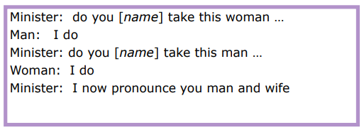
- marriage service
- general flow, generic – blanks for names
- pattern of interaction between people
- computer dialogue
- pattern of interaction between users and system
- but details differ each time
- marriage service
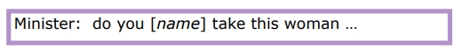
Network diagrams
-
Show different paths through system
- What leads to what
- What happens when
- Including branches
- More task oriented then hierarchy
Wider still
- Between applications
- And beyond …
Wider still …
- Style issues:
- platform standards, consistency: Windows vs MacOS
- Functional issues
- cut and paste: ^C & ^V
- Navigation issues
- embedded applications
- links to other apps … the web
User action and control
- Entering information
- Knowing what to do
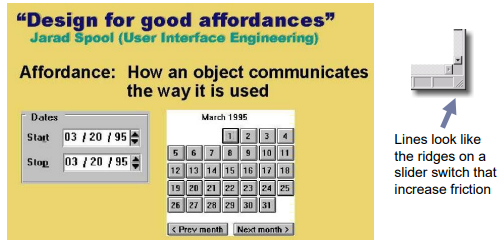
- Affordances
Entering information
- Forms, dialogue boxes
- presentation + data input
- similar layout issues
- alignment – NB: different label lengths
- Logical layout
- use task analysis
- groupings
- natural order for entering information
- top-bottom, left-right (depending on culture)
- set tab order for keyboard entry
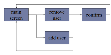
Knowing what to do
- What is active, what is passive
- where do you click
- where do you type
- Consistent style helps
- e.g. web underlined links
- Labels and icons
- standards for common actions
- language – bold = current state or action
Affordances
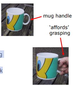
- Psychological term
- The perceived and actual properties of an object that determine how it could possibly be used
- For physical objects
- shape and size suggest actions
- pick up, twist, throw
- also cultural – buttons ‘afford’ pushing
- shape and size suggest actions
- For screen objects
- button-like object ‘affords’ mouse click
- physical-like objects suggest use
- Culture of computer use
- icons ‘afford’ clicking
- or even double clicking … not like real buttons!
Affordance Examples
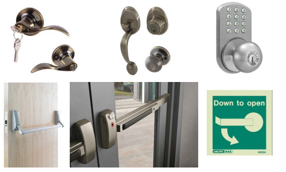
Affordances in GUI Design
- Buttons drawn as 3D shapes appear to “stick out” and hence afford pushing.
- Sliders and scroll bars afford dragging
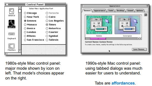
Tabbed Dialogs
Appropriate appearance
- Presenting information
- Aesthetics and utility
- Colour and 3D
- Localisation & internationalisation
screen design and layout
- basic principles
- grouping, structure, order
- alignment
- use of white space
basic principles
- ask
- what is the user doing?
- think
- what information, comparisons, order
- design
- form follows function
available tools
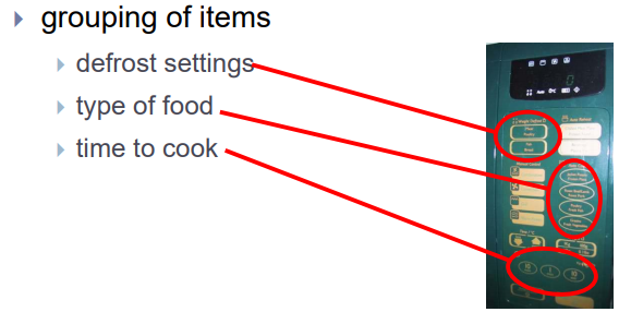
- grouping of items
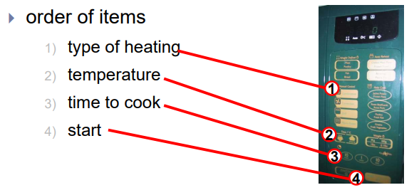
- order of items
- decoration - fonts, boxes etc.
- alignment of items
- white space between items
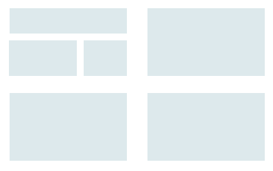
grouping and structure
logically together => physically together
order of groups and items
- think! - what is natural order
- should match screen order!
- use boxes, space etc.
- set up tabbing right!
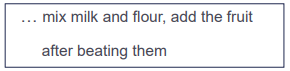
- instructions
- beware the cake recipe syndrome!
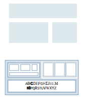
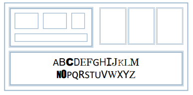
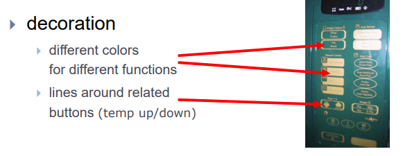
decoration
- use boxes to group logical items
- use fonts for emphasis, headings
- but not too many!!
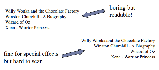
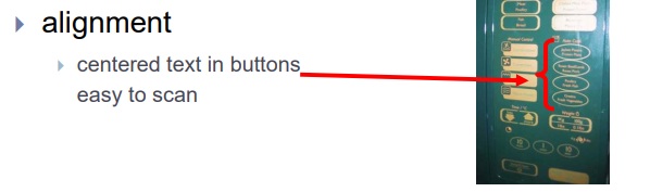
alignment - text
- you read from left to right (English and European) ==> align left hand side
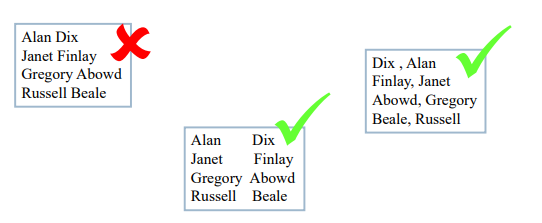
alignment - names
- Usually scanning for surnames => make it easy!
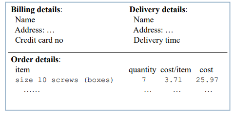
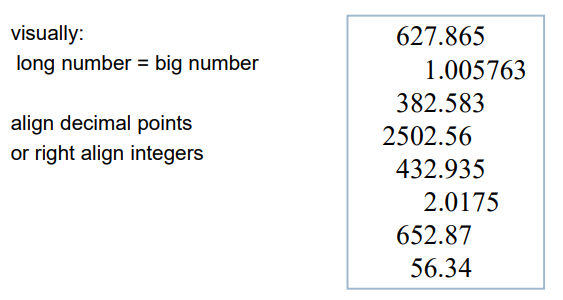
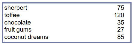
alignment - numbers
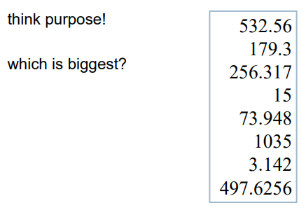
alignment - numbers
multiple columns
- scanning across gaps hard: (often hard to avoid with large data base fields)
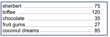
multiple columns - 2
- use leaders
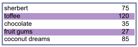
multiple columns - 3
- or greying (vertical too)
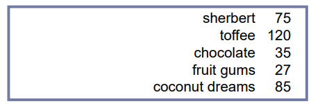
multiple columns - 4
- or even (with care!) ‘bad’ alignment
white space - the counter
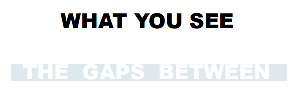
space to separate

space to structure
space to highlight

physical controls
댓글남기기