[HCI] 6. Interaction Design Basics 3
[toc]
Across countries and cultures
- Localisation & internationalisation
- changing interfaces for particular cultures/languages
- Globalisation
- try to choose symbols etc. that work everywhere
- Simply change language?
- use ‘resource’ database instead of literal text … but changes sizes, left-right order etc.
- Deeper issues
- cultural assumptions and values
- meanings of symbols
- e.g tick(√) and cross(x) … +ve and -ve in some cultures … but … mean the same thing (mark this) in others
Iteration and prototyping
- Getting better …
- … And starting well
Prototyping
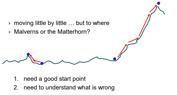
- You never get it right first time
- If at first you don’t succeed …

Pitfalls of prototyping
Some methods of prototyping
-
UI builders (Visual Studio, …)
- draw a GUI visually by dragging and dropping UI controls on screen
- in the past, was done in simple languages like Visual Basic
- modern IDEs have UI builders for more robust languages such as Java
-
implementation by hand
- writing a “quick” version of your code

Paper prototyping
- paper prototyping: a means of usability testing where representative users perform tasks by interacting with a paper version of a user interface
- Why paper prototype?
- paper prototype 말고 Why not just code up a working prototype?
- -> paper prototype is much faster to create than code
- can make changes to paper faster than code (editable)
- paper has more visual bandwidth (can see more at once)
- paper prototyping is more conducive to working in teams than most programming or normal prototyping
- paper prototyping can be done by non-technical people, or people with programming experience in different languages
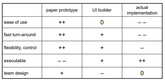
Comparison of techniques
Where does P.P. fit in?
- At what point in the software lifecycle should we do (paper) prototyping? When would it be most useful to do it? Why?
-
We talk about requirements being about “what” and design being about “how.” Which is paper prototyping?
- PP helps us uncover requirements and also upcoming design issues
- do PP during or after requirements analysis; before design
- “what” vs. “how”: PP shows us “what” is in the UI, but it also shows us details of “how” the user can achieve their goals in the UI; I categorize it as “how”
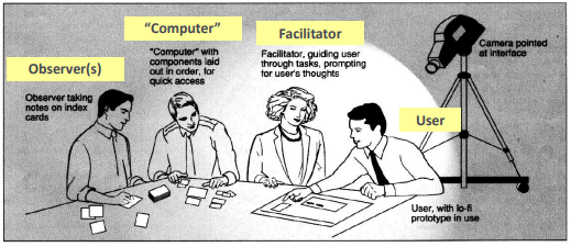
A paper prot. usability session
- user is given tasks to perform using the paper prototype
- session can be observed by people or camera
- one developer can “play computer“ – Wizard of Oz
UI design, components
- When should we use:
- A button?
- A check box?
- A radio button?
- A text field?
- A list?
- A combo box?
- A menu?
- A dialog box?
- Other..?
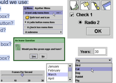
UI design - buttons, menus
- use buttons for single independent actions that are relevant to the current screen
- try to use button text with verb phrases such as “Save” or “Cancel”, not generic: “OK”, “Yes”, “No”
- use Mnemonics or Accelerators (Ctrl-S)
- use toolbars for common actions

- use menus for infrequent actions that may be applicable to many or all screens
- Users hate menus! Try not to rely too much on menus. Provide another way to access the same functionality (toolbar, hotkey, etc)

- Users hate menus! Try not to rely too much on menus. Provide another way to access the same functionality (toolbar, hotkey, etc)
UI design - checkboxes / radio
- use check boxes for on/off switches, when any one switch can be toggled irrespective of the others (often correspond to boolean values)
- use radio buttons for related choices, when only one choice can be activated at a time (often corresponds to enum / constant values)

UI design - lists, combo boxes
- use text fields (usually with a label) when the user may type in anything they want

- use lists when there are many fixed choices (too many for radio buttons) and you want all choices visible on screen at once – standard or drop-down

- use combo boxes when there are many fixed choices, but you don’t want to take up screen real estate by showing them all at once
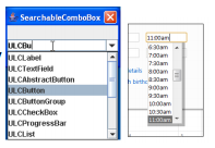
- use a slider or spinner for a numeric value

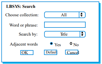
An example UI screen
- What can we say about this UI dialog? Did the designer choose the right components?
- Let’s assume there are 20 collections and 3 ways to search (by title, author, relevancy)
UI design - multiple screens
- use a tabbed pane when there are many screens that the user may want to switch between at any moment

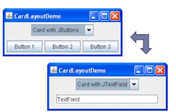
- use a CardLayout to “swap” between screens when necessary (not switchable by user)
- use dialog boxes or option panes to present temporary screens or options

Creating a paper prototype
- gather materials
- paper, pencils/pens
- tape, scissors
- highlighters, transparencies
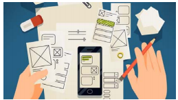
- identify the screens in your UI
- consider use cases, inputs and outputs to user
- think about how to get from one screen to next
- this will help choose between tabs, dialogs, etc.
Application backgrounds
- draw the app background (the parts that matter for the prototyping) on its own, then lay the various subscreens on top of it
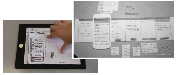
Representing a changing UI
- layers of UI can be placed on top of background as user clicks various options
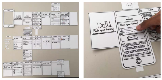
Representing interactive widgets
- buttons / check boxes: tape
- tabs, dialog boxes: index cards
- text fields: removable tape
- combo boxes: put the choices on a separate piece of paper that pops up when they click
- selections: a highlighted piece of tape or transparency
- disabled widgets: make a gray version that can sit on top of the normal enabled version
- computer beeps: say “beep” (hah!)
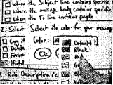
Example paper prot. screen
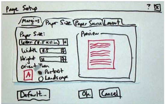
Example full paper prototype
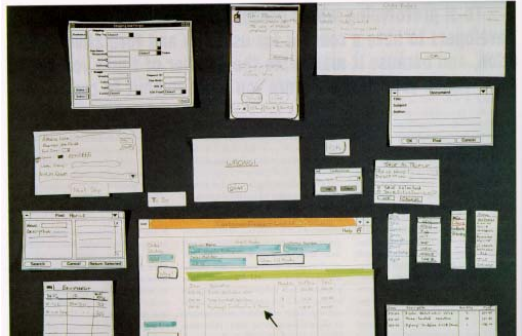
Paper Prototyping Tools
- A marker and a sheet of paper
- very basics: a marker and a sheet of paper.
- Paper prototyping is a fast, easy and fun way to get a first impression on your concept.
- Paper prototyping is very accessible for people of all backgrounds. The lack of details in paper prototypes will make people focus more on the idea.
- colors and layouts are just not relevant at this stage of development.
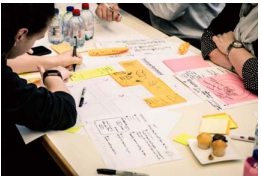
- PowerPoint / Keynote
- You can create a digital prototype with Microsoft Office PowerPoint or Apple Keynote.
- If you’re not a designer, you should really start from the software that you have already mastered and have on your desktop, rather than other professional services.
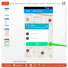
- 디자이너가 아니라면 다른 전문 서비스보다는 이미 익혀 데스크톱에 있는 소프트웨어부터 시작해야 한다.
- Smartphone sketch templates
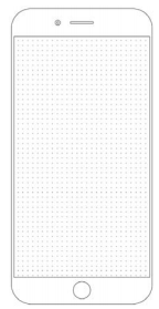
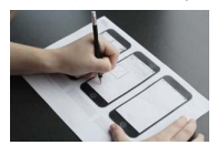
- For apps and other digital services, smartphone sketches are a great way to start.
- These useful templates with or without a precision grid to get you started. Translate your app ideas into real screen designs, perfect to test product assumptions with your customers.
- Explainer videos:
Whiteboard & Animated Explainers
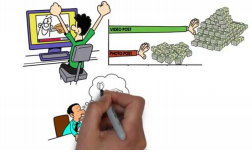
- The easiest way to explain your solution is by telling a story.
- Explainer videos give you the opportunity to share your concept with hundreds of potential customers via social media and to get instant quantitative and qualitative feedback.
- You can use video capture tools for this purpose
-
Graphic tools: Sketch/Photoshop
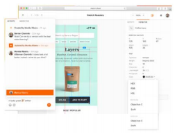
- Sketch is made solely for turning your wireframes into great looking designs. Sketch also has an abundance of templates to make your prototyping just that bit faster.
- 스케치는 와이어 프레임을 멋진 디자인으로 바꾸기 위해 만들어졌습니다. 또한 Sketch에는 프로토타입을 훨씬 더 빠르게 만들 수 있는 템플릿이 많이 있습니다.
-
The downfall of this gem is that it’s only available on Apple computers.
-
Photoshop is a great tool to transform your wireframes into beautiful designs.
- It’s not made for prototyping,but it does a great job of using it for that purpose.
- Sketch is made solely for turning your wireframes into great looking designs. Sketch also has an abundance of templates to make your prototyping just that bit faster.
Dedicated Paper Prototyping Programs
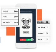
- POP by Marvel
- The POP (Prototype On Paper) bridges the gap between paper and digital prototype by helping you make on screen links between several paper prototype sketches.
- Proto.io
- Proto.io lets you create high-fidelity prototypes of Apps, with ready-made libraries and elements such as menus, buttons, and more.
- Invision
- It is similar to POP. But Invision offers many cooperative work functions

댓글남기기